How Color Psychology Can Improve Your Business
December 27, 2021
One of the reasons we got into web design and branding was our fascination with the psychology behind the design. Understanding how the brain works when presented with certain stimulation gives you the ability to harness that power. Once you have mastered that power you can influence the way that people think.
Sounds like freaky mind control right? Well, in a way you’re right. For decades people have been able to subconsciously affect the way you think, what you eat, and even how you behave. We have gotten so used to it that we barely even notice it’s there anymore.
The next time you are at a grocery store, take a second to notice the packaging, the posters, the smells, and yes, even the placement of products (did you know that companies pay for the spot they get on a shelf??). All of it is strategically trying to influence the way you shop.
As an online business most (if not all) of your influence over potential clients comes visually. So let’s talk about your most powerful tool when it comes to strategically designing your online presence – color.
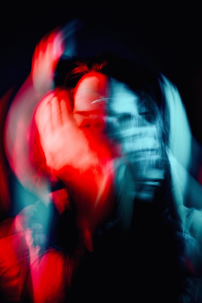
Color has a powerful influence on our gut reactions to things. For instance, this picture might make you feel confused and disoriented.
While this image probably makes you feel happy, excited, and adventurous.
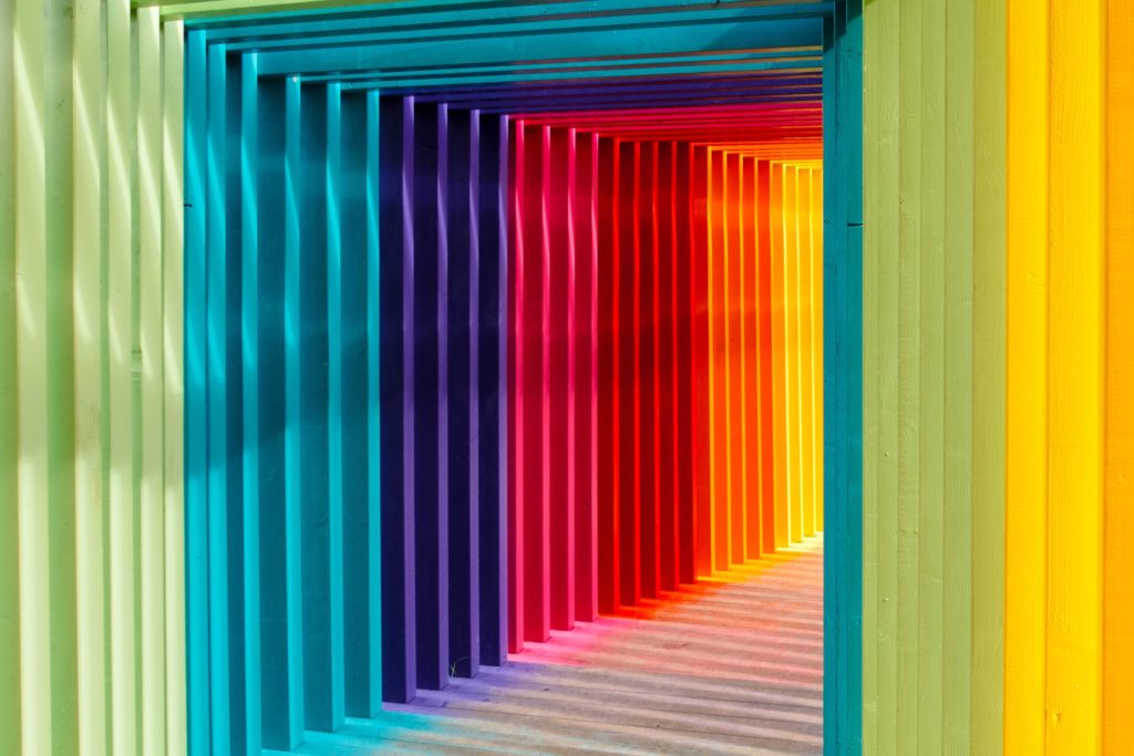
One of the biggest reasons you feel that way is the use of colors. Pretty cool right?
So let’s delve into the specifics of color psychology, shall we?
Red
Red is a great color for grabbing people’s attention. (Why do you think stop signs are red?) The reason for this is that red light waves are the longest, making them the second most visible to the human eye. (right behind yellow)
Red creates a sense of excitement, energy, and love. Being exposed to red for long periods of time can actually have some physical effects on the body such as an increased heart rate and rising blood pressure. (Told you colors were powerful 😉 Check out this super cool study done on the effects colors have on the body.)
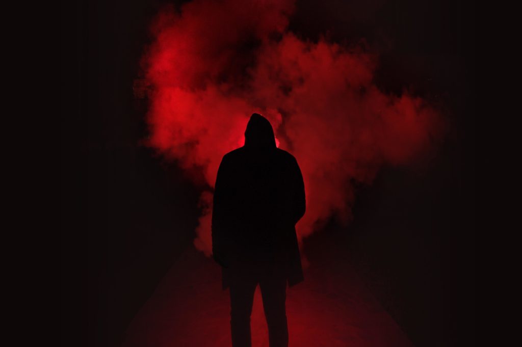
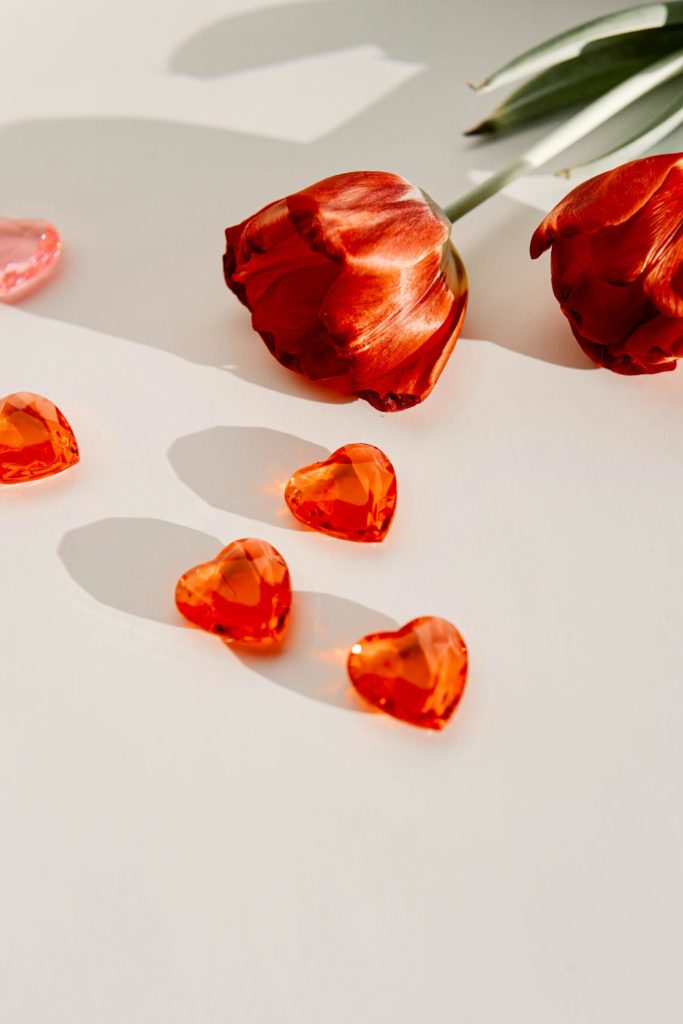
While red is often associated with passion and romance, the flip side can also be true. Red can also represent dominance, power, and aggression. Look at these two images of red. See how different they are?
Orange
A very underrated color if you ask me. This is the most energetic color. Its vibrance excites people. You can’t help but be happy when you see the color orange used correctly.
Because it is such a bright color it is also used as a safety color. When used correctly, orange is a powerful tool. In design, you have to be careful that it doesn’t overpower the message you are trying to portray.
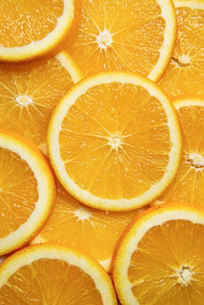
It can also be used as a very cozy and warm color. Check out the difference between how these two images make you feel, both using orange.

Yellow
Yellow is notoriously a happy color. Yellow has some cool effects on the body. It’s attention-grabbing, can help improve cognitive function, and even increase your metabolism!
Unfortunately for online business owners-, yellow is hard to look at for long periods of time and nearly impossible to read on a computer. Reading in yellow can make your eyes more tired than any other color. See what I mean?
If used too much it can agitate the viewer. If paired with red it can increase your appetite. (Smart move McDonald’s 😏)
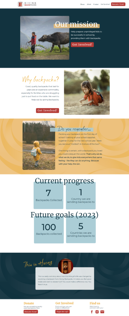
Don’t be afraid of yellow but make sure you use it strategically. Check out these website examples we created to help guide you to use yellow correctly.
Green
Green is associated with nature, wealth, and cleanliness. It can be used to increase creativity as well as a sense of renewal and peace.
It’s also often associated with fertility and the renewal of life.
But you have to be careful (like always) because green can often denote envy, which I can only assume is not the message you are hoping to give.
Blue
I love the color blue. Blue is calming, professional, and wise. It is often used by medical offices to help their patients feel calm even when dealing with potentially scary situations.
Blue compliments many colors very well. That being said, it doesn’t have to be a complimentary color like yellow does. It can definitely stand on its own.
You do have to be careful not to overuse blue because it can also be associated with being icy, cold, sad, or aloof.
Here are some fun facts about blue.
- It is the color found least in plants and food. That makes the color blue a very appetizing color.
- It’s widely accepted as the favorite color. (Especially by men.)
- It’s said that blue can actually help you focus. If you are working from home, consider decorating your home office with blue.
Purple
Purple is often the color used for royalty. That’s probably because it invokes feelings of majesty and mysticism (if you don’t believe me go check out the picture below). Lighter shades of purple tend to be more romantic, light-hearted, and fun while darker shades are more classy and denote status.

A deeper purple can be used to give the impression of luxury. You will see it used this way on higher-end products like jewelry, fine chocolates, and of course, Hallmark (home to the best holiday entertainment 😂)
Used without care, purple can symbolize hopelessness and frustration.
Pink
Pink is very stereotypically associated with all things girly. But it’s also a very calming color that represents love and compassion. It brings a feeling of hope to its viewers.
If used right, pink is a powerful color! It is thoughtful, insightful, and intimate. It brings out the nurturing side of people. Several jails in Switzerland have actually painted cells pink in order to calm inmates who are acting aggressively. Check out this article talking more about it!
Because pink is such a playful color, you probably don’t want to use it if your business is more serious. You wouldn’t go into a bank with baby pink walls… well, you might but it would feel weird.
Brown
If you are like me, you don’t often think of brown when discussing colors. There is a reason for that. Brown is a non-competitive color that feels very reliable.
It’s a very grounding color (no pun intended). It helps people feel secure. It’s great for balancing out the brighter colors mentioned above. Because of the association with the earth, it helps us remember to connect to our roots and gives a homey sort of feel.

Okay… obviously I could go on about color for a while. I will spare you the novel. The main point of this blog was to make the point that colors hold a lot of power and therefore should be used wisely.
Take the time to reflect on what message you want to send to your potential clients and then find colors to support that message. Need help figuring it out? Let’s hop on a discovery call and talk about how to utilize the power of color in your business!

[…] this guide you need to be really clear about which colors are primary, secondary and accent colors. (See this cool post about colors) The purpose of this guide will help you and your team stay consistent in the way that you use your […]